UI Design InternshipLogistics · TMS · 2024Nexus Info
Liveasy Trust is the product.
Redesigning the homepage of a logistics TMS — where clarity, credibility, and guided action aren't just design goals, they're core usability requirements.
Role
UI Design Intern
Duration
Jul – Aug 2024
Scope
Homepage redesign
Company
Nexus Info
20%
Lift in click-through rates
6
Core pages redesigned
10+
Trust signals integrated
4
Design pillars defined
Background
My first internship. A real product. Real users.
It was my second year when I landed my first UI design internship working on Liveasy — a logistics Transport Management System.
What looked like a visual problem turned out to be a trust problem — and that realization changed everything.
“In logistics, users don't just evaluate features — they evaluate risk. That makes trust a core usability requirement, not a visual afterthought.” — Core insight that shaped the redesign
01
No clear value proposition
The homepage failed to communicate what Liveasy does within seconds
02
Missing trust signals
No client logos, proof points, or credibility markers for high-stakes buyers
03
Weak CTAs and broken flow
Users had no clear next action — the result was hesitation, not conversion
01 — The Problem
What was broken before I touched it.
The existing site had no hierarchy, no trust, and no clear path for a logistics buyer to take action.
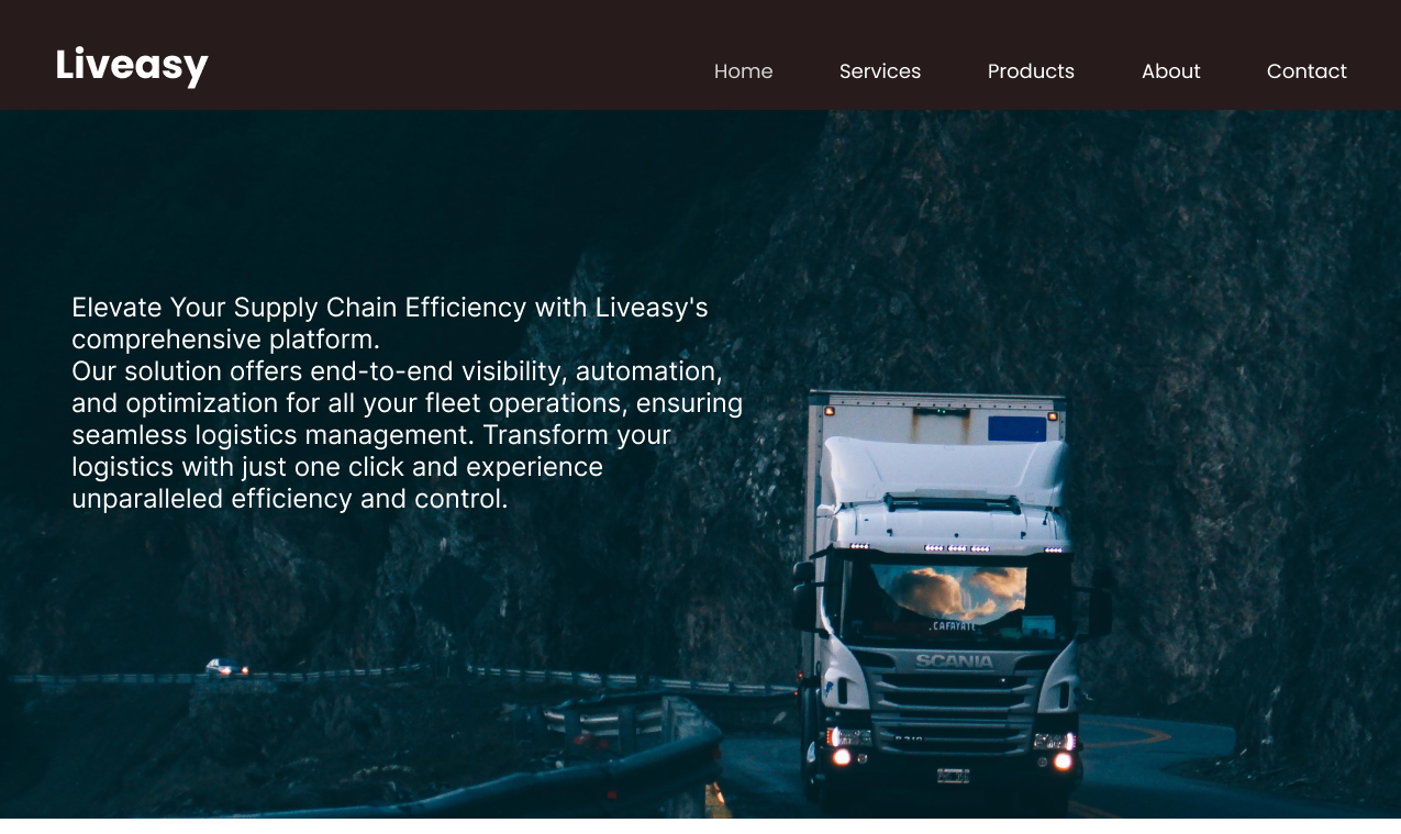
Screen 01 — Hero Section
⚠ Before
✗ What's wrong here
1
Wall of text as the hero — no headline, no value prop
2
No CTA — users have no clear next action above the fold
3
No contrast control on background photo — text barely readable
4
No visual hierarchy — every word carries the same weight
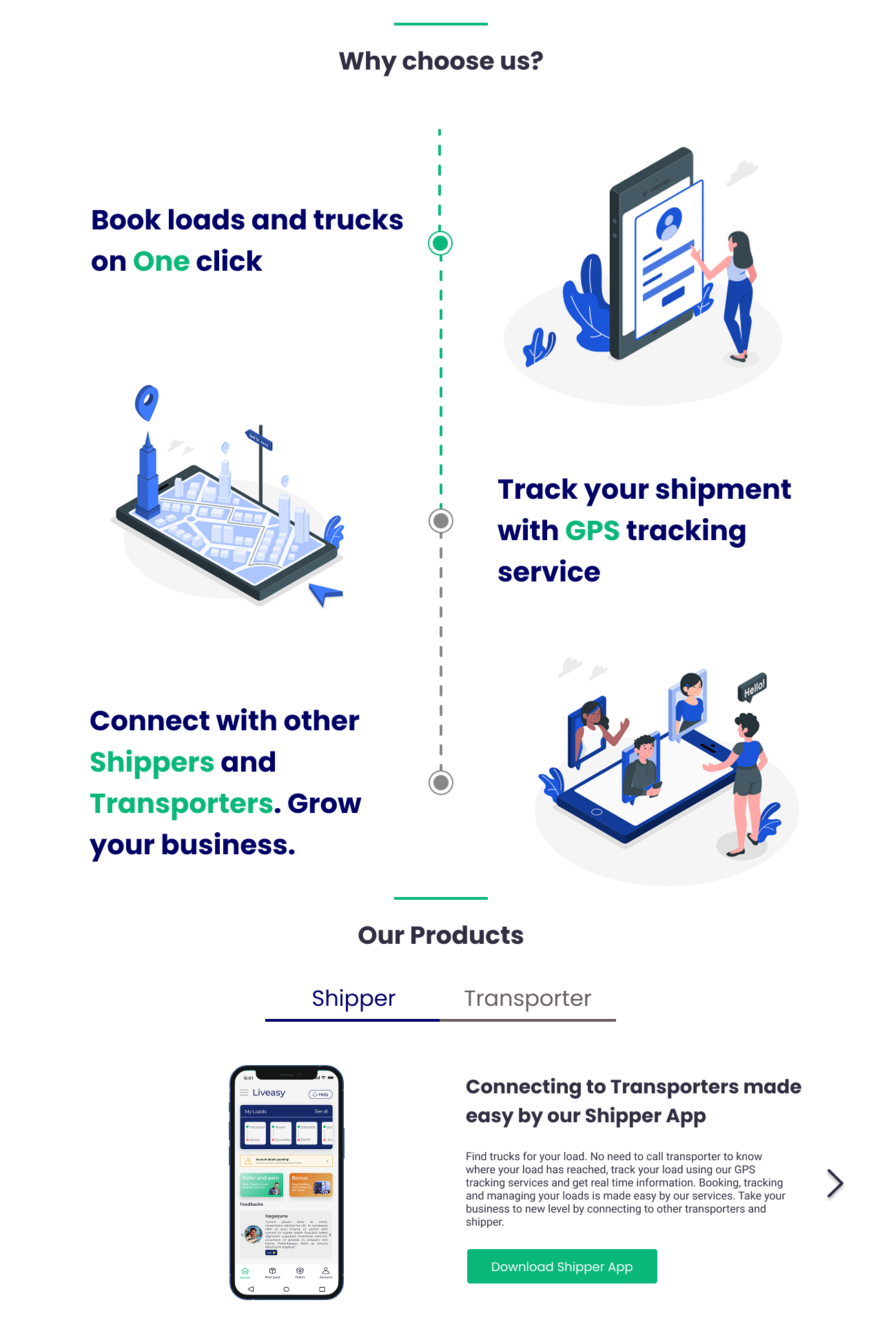
Screen 02 — Features Section
⚠ Before
✗ What's wrong here
1
Cartoon illustrations feel unprofessional for enterprise B2B
2
Zigzag layout with a dashed line creates confusion, not clarity
3
No trust signals — no logos, no stats, nothing to build credibility
4
'Why choose us?' section lists features instead of answering the question
02 — Research
What competitors got right. And where they all fell short.
Before redesigning anything, I analyzed competing logistics and TMS platforms.
What competitors did well
Clear value above the fold
Client logos visible early
Strong primary CTA
Feature sections organized around outcomes
Where they all fell short
Feature-heavy messaging over value
Overloaded hero sections
Generic visual language — products felt interchangeable
Trust treated as an afterthought
03 — Design Pillars
Every decision filtered through four principles.
01
Clarity before aesthetics
Communicate what Liveasy does within seconds. Hierarchy redesigned to prioritize understanding first.
02
Trust is the product
Logistics buyers evaluate risk. Credibility signals embedded throughout the experience.
03
Guide, don't let users wander
One primary CTA. Clear directional hierarchy. Reduced hesitation.
04
Good design is good business
Every decision evaluated through a business lens — understand, trust, or act?
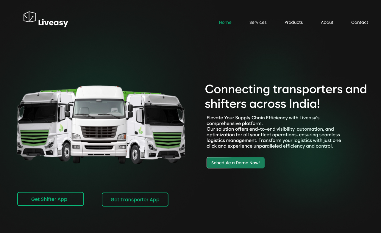
Screen 01 — New Hero
✓ After
✓ What changed & why
1
Clear headline 'Connecting transporters and shifters across India' — purpose in 3 seconds
2
One primary CTA (Schedule a Demo) — no competing actions above the fold
3
Truck imagery used intentionally — visual context, not decoration
4
Secondary app CTAs below — hierarchy preserved
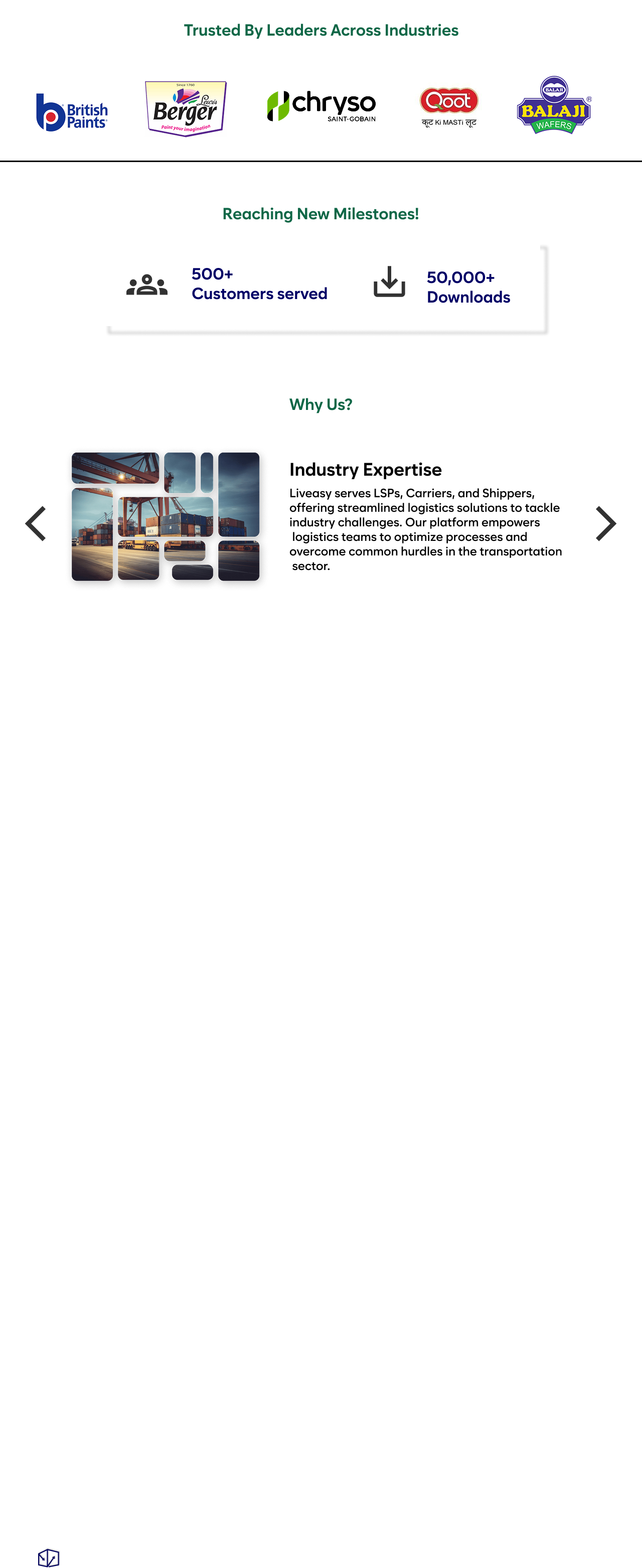
Screen 02 — Trust & Logos
✓ After
✓ What changed & why
1
Client logos from British Paints, Berger, Chryso — instant enterprise credibility
2
Stats strip: 500+ customers, 50,000+ downloads — proof before features
3
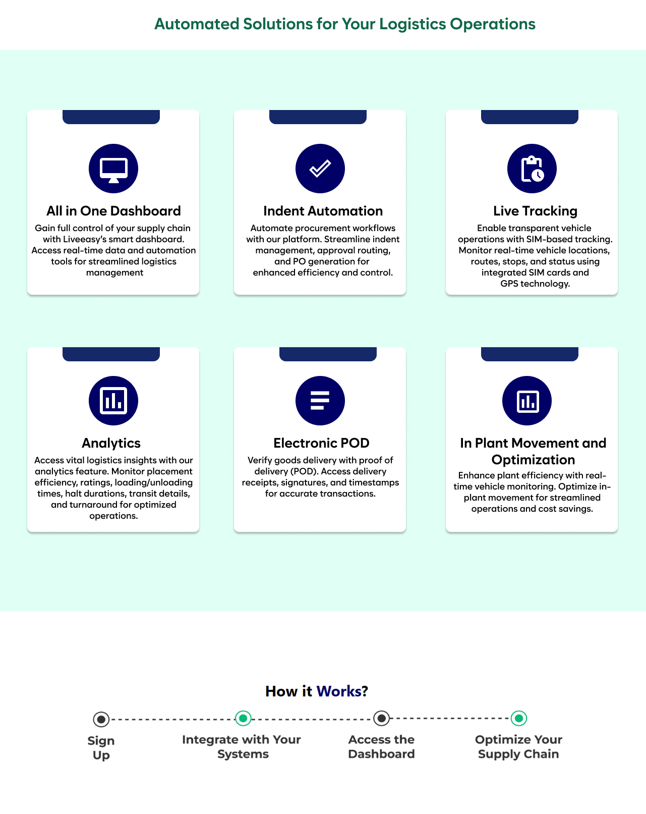
Replaced cartoon illustrations with clean feature cards
Six feature cards in a 3-col grid with consistent iconography
2
Each card leads with capability, then explains the business outcome
3
'How it Works' step flow gives buyers a clear mental model
4
Teal section creates breathing room before the footer CTA
04 — Reflection
What designing for enterprise trust taught me.
01
Context changes everything
Logistics buyers evaluate risk, not just features. Understanding the user's emotional context completely changed how I approached every decision.
02
Competitive analysis before pixels
Studying competitors before touching Figma meant I wasn't designing in a vacuum. I knew the baseline, which made it possible to deliberately go beyond it.
03
Design pillars as a filter
"Does this build trust?" became more useful than "does this look good?" Pillars gave every decision a reason to exist.
Next Case Study
Lighthouse AI
AI coaching product · Playbook feature · End-to-end design