
Key Responsibilities
Redesigning UI
Improving CTAs
Integration of Credibility
Information Architecture Enhancement
ItwasmysecondyearofB.TechinComputerSciencewithDesignwhenIlandedmyfirstUIdesigninternship.IgottheopportunitytoworkonLiveasy,alogisticsTMS,wherethegoalwassimplebutmeaningful—redesignthehomepageofaproductusedinrealoperationalworkflows.I’vealwaysbeendrawntoproductsthatsitattheintersectionofcomplexityandclarity,andLiveasywasexactlythat:achancetomodernizehowlogisticssoftwarepresentstrust,structure,andintent.
Myresponsibilitywasstraightforward—bringclaritytocomplexity.Ifocusedonredesigningthehomepagebyimprovinginformationarchitecture,sharpeningCTAs,strengtheningcredibility,andgivingtheproductamoremodern,confidentvisuallanguage.Itwasmyfirsttimedesigningforscaleandrealusers,andI’mproudofhowtheexperienceevolvedintosomethingclearer,morehuman,andmoreusable.
Understanding Liveasy
Liveasy is a Transport Management System (TMS) designed to help businesses manage freight, optimize logistics operations, and gain visibility across their supply chain.
In industries like logistics, users don’t just evaluate features, they evaluate risk.
They’re trusting a platform with shipments, timelines, and high-value goods.
That makes trust a core usability requirement, not a visual afterthought.
However, Liveasy’s existing homepage did not clearly communicate:
What the platform does at a glance
Who it is designed for
Why it can be trusted with mission-critical operations
The result wasn’t a lack of interest — it was hesitation.
Before redesigning the interface, the first step was aligning the homepage with the real expectations of logistics decision-makers: clarity, confidence, and credibility.
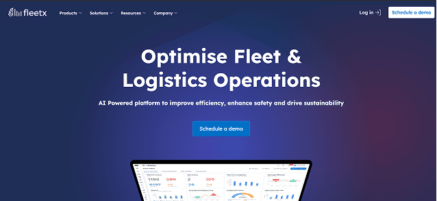
Competitive Analysis
Before redesigning Liveasy’s homepage, I analyzed competing logistics and TMS platforms to understand how they communicate value, trust, and differentiation.
What Competitors Did Well
Clear Value Above the Fold: Most competitors immediately communicated what they do and who the product is for, reducing confusion for first-time visitors.
Basic Credibility Signals: Client logos, numbers, and enterprise language helped establish an initial level of trust.
Feature Visibility: Key features were clearly showcased, helping users understand platform capabilities.
Strong Sales-Oriented CTAs: Clear CTAs like Request a Demo or Talk to Sales guided high-intent users toward conversion.
Where They Fell Short
Feature-Heavy Messaging: Many platforms focused too much on listing features, rather than trying to gain more trust or showcase real value.
Overloaded Hero Section: Too much information upfront created cognitive overload instead of clarity.
Generic Visual Appel: Similar layouts, stock visuals and buzzwords made products feel interchangeable and undifferentiated.
Key Takeaways
Most competitors met industry expectations—but few went beyond them.
This created an opportunity for Liveasy to stand out by focusing on clarity, trust, and guided decision-making, rather than feature density.
The Redesigning
This was the execution phase where we transformed wireframes into high-fidelity designs. The key UI improvements included:
Hero Section — Setting the First Impression
Key Takeaways
The hero section was redesigned to immediately communicate what Liveasy does, who it’s for, and why it matters—all within the first few seconds of landing on the page.
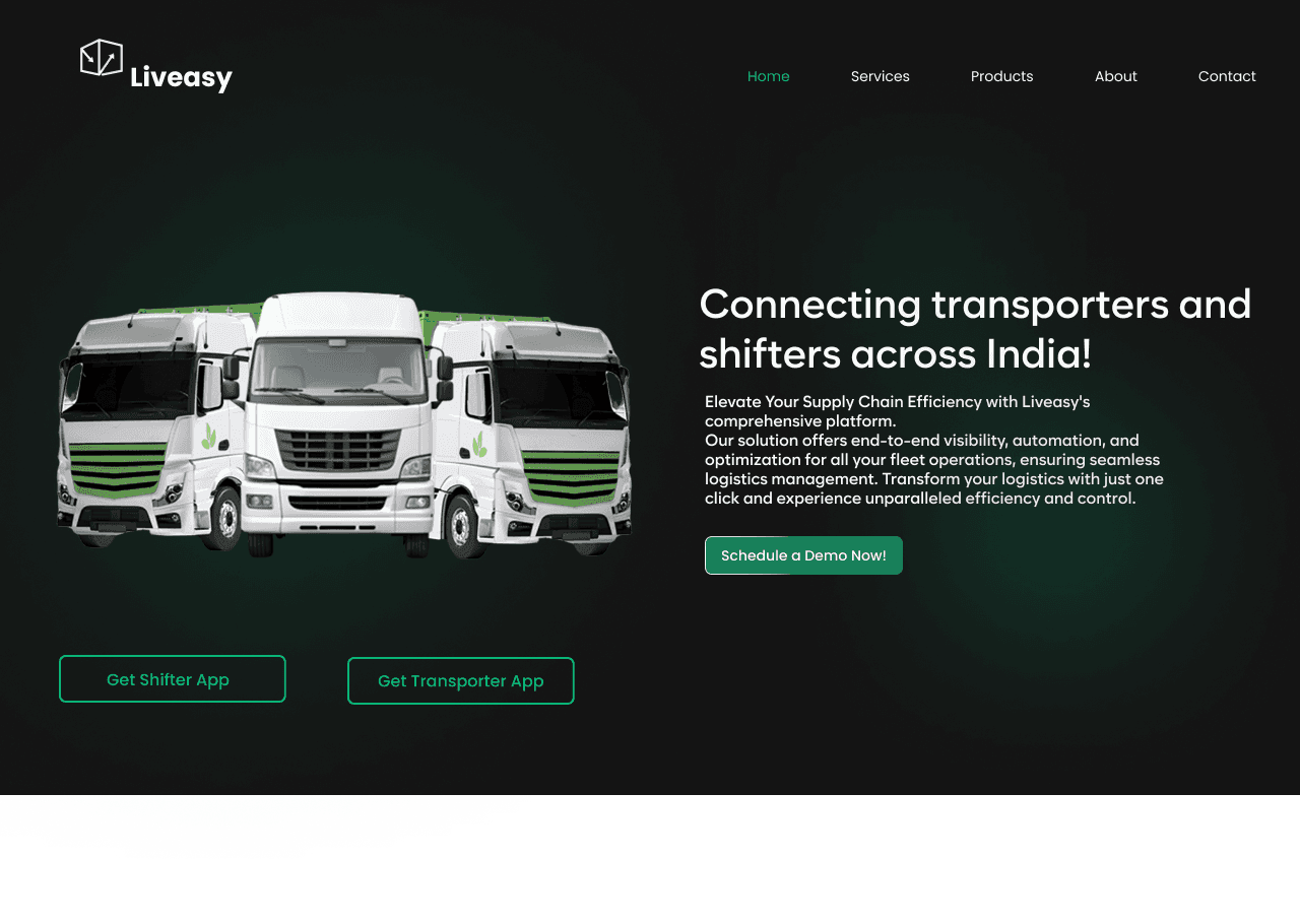
Modern and Clean Visual Appeal
Strong Visual Hierarchy
Clear CTAs
Better Readability
Better Brand Positioning
Use of Engaging Imagery
Consistent Color Scheme
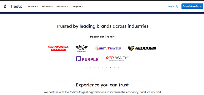
Establishing Trust at Scale
Key Takeaways
In logistics, decisions aren’t made on aesthetics alone—they’re made on trust, reliability, and proof.
By showcasing recognizable client logos and real adoption metrics, the experience moves users from curious to confident without requiring additional explanation.
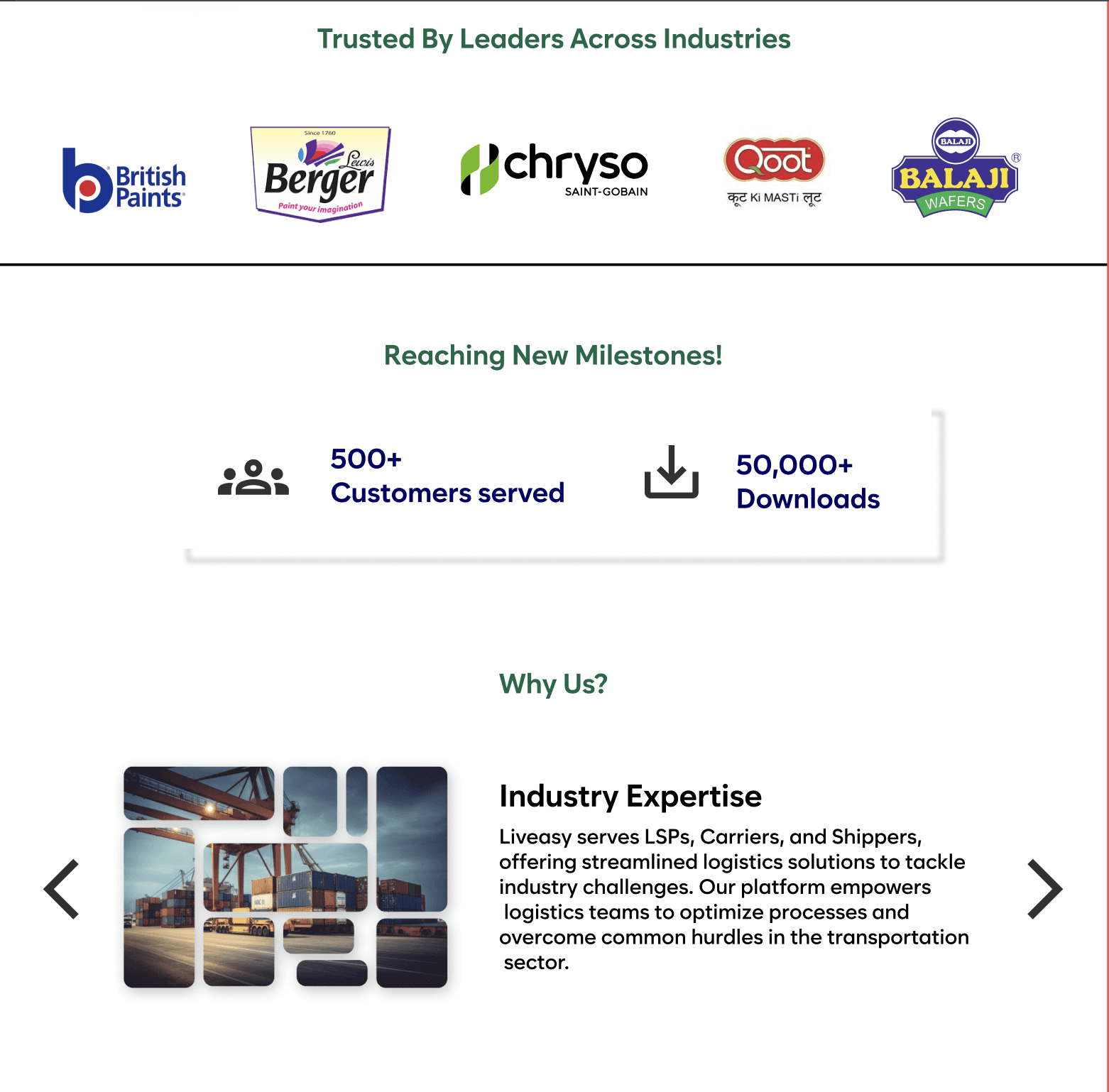
Enhanced Credibility
Stronger Social Proof
Clear Hierarchy
Better Readability
Confidence Building
Use of Engaging Imagery
Consistent Color Scheme
Translating Capabilities Into Clear Value
Key Takeaways
nstead of overwhelming users with technical depth, features were organized to highlight practical outcomes—what users gain, what problems are solved, and how each capability fits into the larger system.
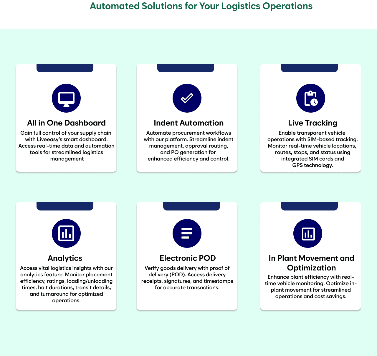
Clear Value Communication
Stronger Trust
Improved Hierarchy
Better Readability
Feature Clarity Over Overload
Use of Engaging Icons
Why the Redesign Was Necessary
Liveasy’s homepage wasn’t just outdated — it failed to clearly communicate value, build trust, or guide users toward action. These gaps directly impacted usability, confidence, and conversions.
My Design Pillars
To guide the redesign, I defined a clear set of design pillars. These acted as decision filters—every layout, section, and interaction had to align with at least one of these.
Clarity Before Aesthetics
The homepage needed to communicate what Liveasy does within seconds.
Content hierarchy and section flow were redesigned to prioritize understanding before aesthetics.
The previous experience left users unsure of what to do next.
Clear CTAs and directional cues were introduced to reduce hesitation and guide users toward meaningful actions.
Modernize the UI. Every decision was evaluated through a business lens—
Does this help users understand, trust, or take action?
In logistics, users are trusting a platform with real business operations.
The redesign embedded credibility signals and validation directly into the experience instead of treating trust as an afterthought.
Trust Is the Product
Good Design Is Good Business
Guide, Don't Let Users Wander
Missing Trust and Credibility Signals
No Clear Call To Actions
Outdated UI and Broken Flow
Poor Information Architecture
Let'sConnect.
I'mopenforaProductDesignerrolewhereIcanworkonproblemsandhelpsimplifycomplexexperiences.Ifyouthinkwemightbeagoodfit,letsconnect.
God Bless the White Monster Energy.
Resume
View & Download
shahmanav1911@gmail.com
(617) 749-8140
Contact
Let's connect!
Some worthy UI shots
Dribbble